
The Rise and Fall of Global Unemployment
Subject
We hear a lot about unemployment these days. It's been the primary focus of every presidential race since 2008. But how do our current unemployment numbers compare to past unemployment? Or to unemployment numbers of other major countries? I’m interested in exploring global employment statistics and identifying employment
trends through time. I've chosen to present unemployment data using a line graph.
The Data
The data set consists of International Labor Comparisons from the Bureau of Labor
Statistics (found here) from the United States Department of Labor. It is very detailed and shows
employment data from 1970 to 2012 of the following countries: United States,
Australia, Canada, France, Germany, Italy, Japan, Korea, Mexico, the Netherlands, New
Zealand, South Africa, Spain, Sweden, Turkey and the United Kingdom.
Limited data was collected from a few countries, so they will be excluded from the
visualization.
The data set also includes employment statistics divided by different sectors of the economy (agriculture, industry, manufacturing, and services), as well as unemployment statistics divided by age group and gender. The excel file is very clear and easy to understand.
Interaction
I want users to be able to compare data from two or more different countries of their choosing, so I'd like the user to be able to toggle the line of each country on and off.
Technology
I used HTML, CSS, Javascript, jQuery and D3 to build this visualization.

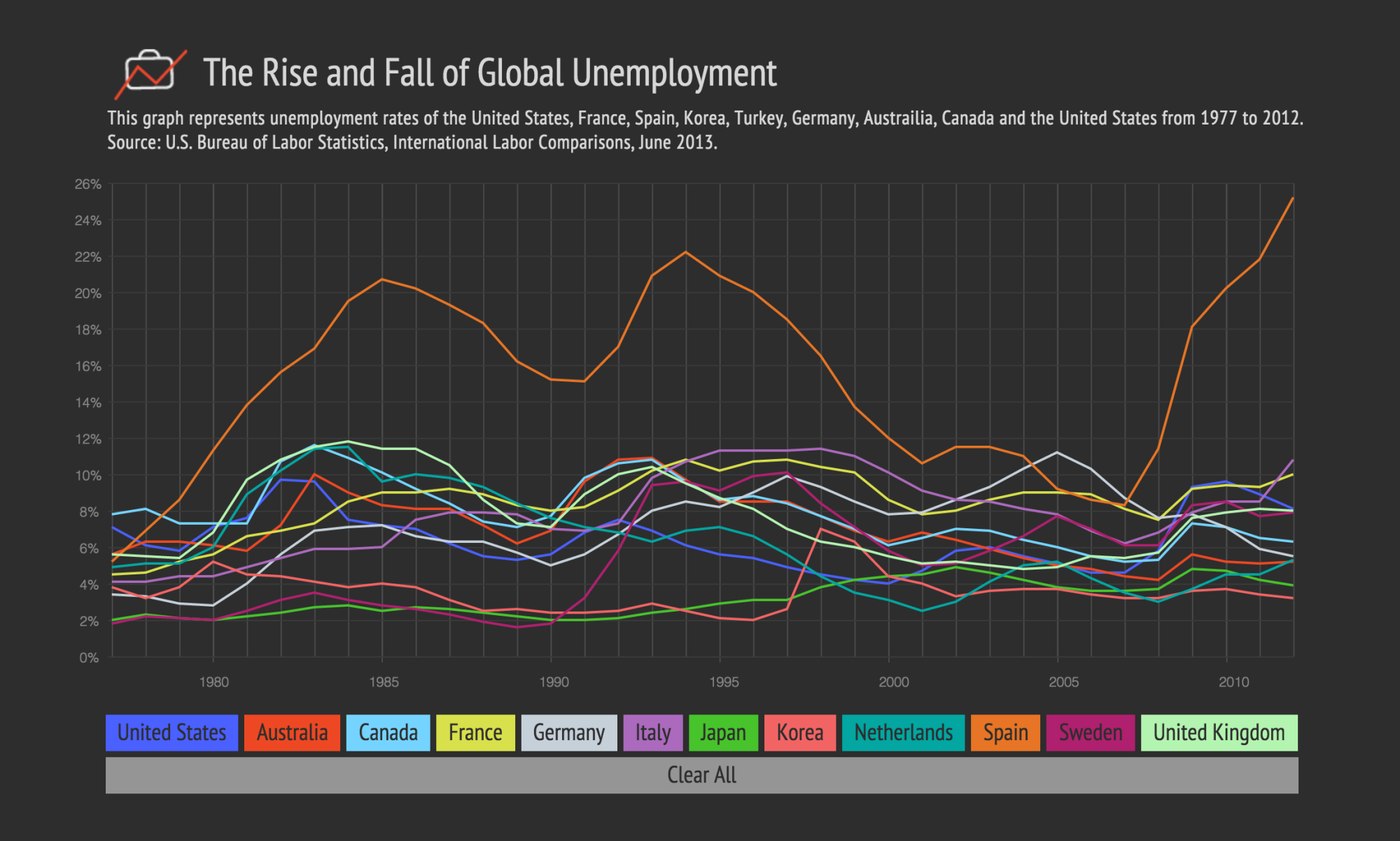
main visualization view
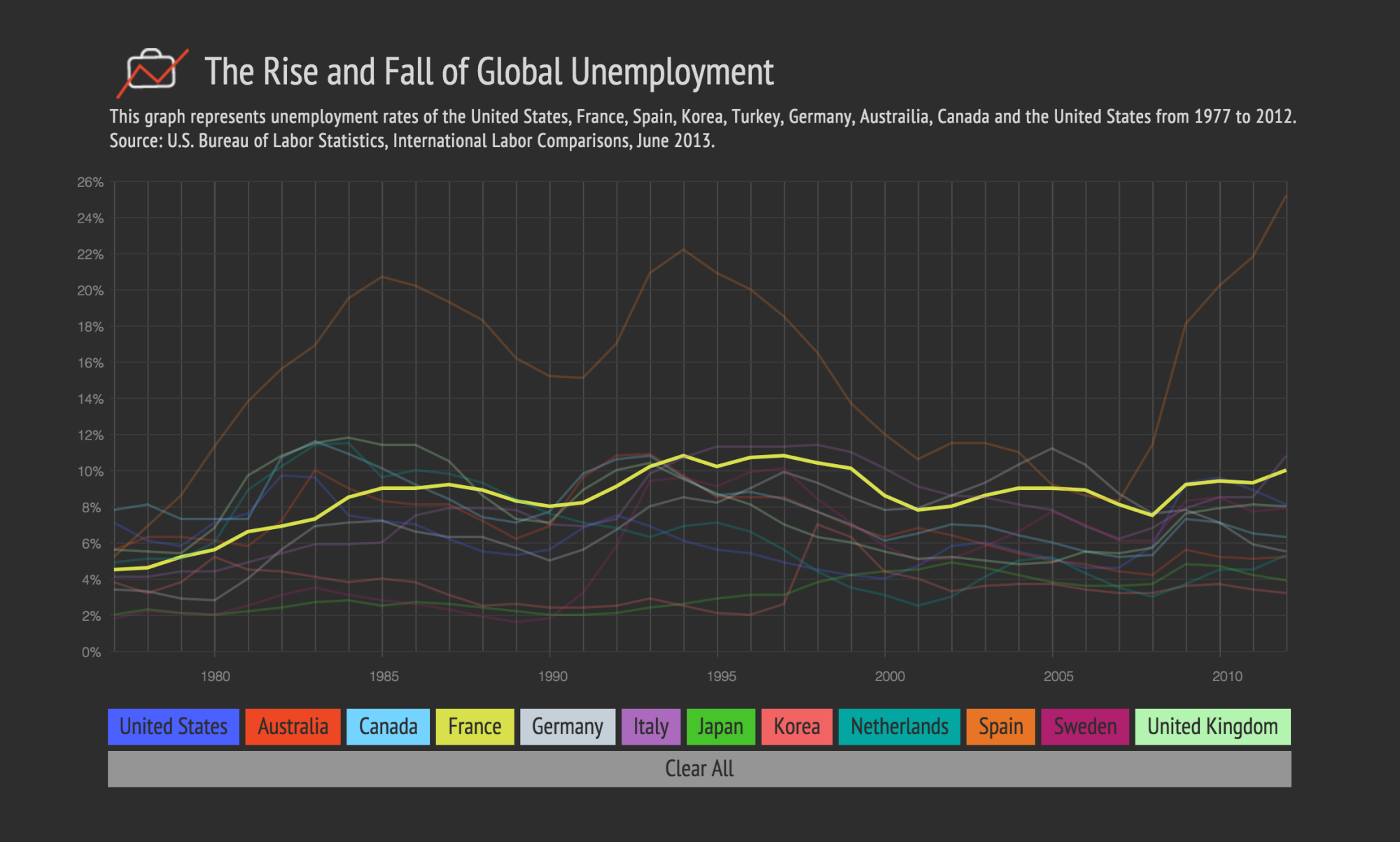
Toggle view of France's data
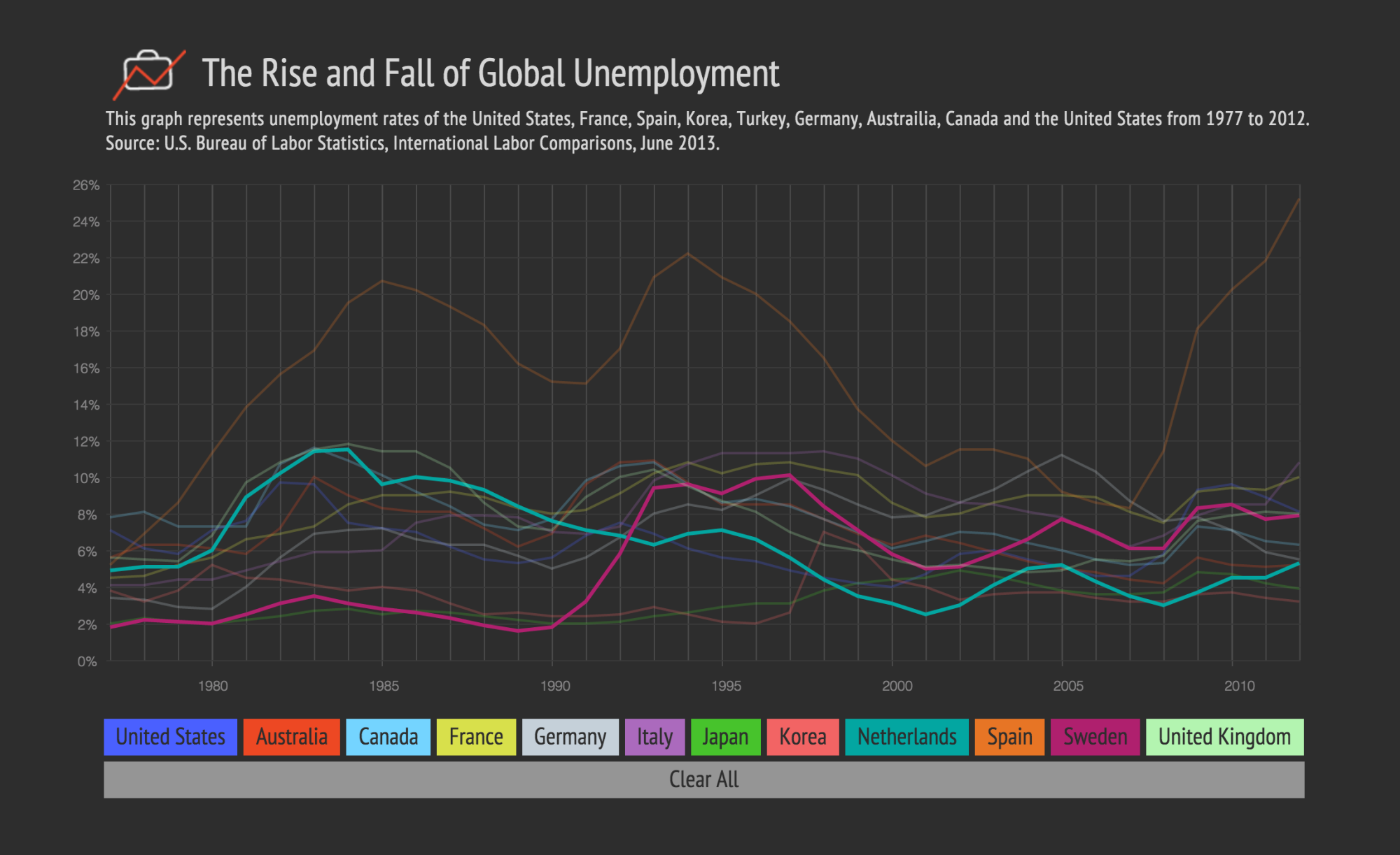
Netherlands and Sweden comparison view


